Wednesday, 23 October 2013

ASSIGNMENT 5;
MY OWN INTERPRETATIONS
Me and my two friends, Olivia and Niamh decided to make our own interpretations of Vee Speers portfolio 'Thirteen' and 'The Birthday Party' with our own little edge to spice the photos up a bit. We really liked his idea about the girls in thirteen going through growing pains. Me, Olivia and Niamh had the idea that we could make us look thirteen but as if we wanted to grow up so desperately that we started getting aggressive and mental about the whole situation. 
^ Click on the links above to see Vee Speers portfolio on each of them. 
 
We tried recreating this by standing in front of a white wall (shame about the fire box but we couldn't crop that out) Then because we didn't have a ragged doll,with hair coming out, we decided to use a teddy. It was my idea to be strangling it/ripping it apart. I really like the fact our facial expressions are the same, as if we're really angry and tired of being young. I should have looked at some of the photos in more detail before we took the photos because this girls hair is in plaits and i could have easily done that, as well as the dress because we did actually have one present. Although I didn't want to copy the photo completely I think this is a really good interpretation.
This was my second Interpretation of a picture from Vee Speers 'Birthday party' again. This photo was copied a lot more than the last interpretation with the way my model is standing and the hand is in the same sort of position as well as her hair being up in some sort of way. This photo didn't really have much of a message to me but i used it anyway because the balloon was easy to do.
The next photo we tried to interpret was probably the funnest to do. We also took many photos using the scissors because there were so many positions and different things to do with them. This was the photo that's most like Vee Speers version, although I decided to cross my fingers as if i didn't want anyone to know that i was cutting my hair. I thought it made a really nice edge to the photo.

These are the rest of the photos we took, they were inspired by all of the photos in Vee Speers two collections/portfolios


 - Photography and edits by Maddie Mason


Thursday, 10 October 2013


Factual:
1. This photo is probably the most recent because Katy Perry had black hair around 2012 and it wasn't on Perous 'new' page on his website.
2. I would put Justin Timberlake second because the photo is about his acting career not his music, and he joined the acting career recently ( in the last 3 years)
3. Next i put the film poster for 'love song' because it is released in 2011 and that was only 2 years go.
4, 5, & 6 I put the other photos in any order because there isn't any way on telling when they were taken. Perou doesn't state the dates of his photography on his website, i did research and try to find out but i found nothing so in the end i just had to guess.


Factual:
1. The Katy Perry photo was taken from his 'Music' section of his website, because Katy Perry is an artist.
2. The second photo, of Justin Timberlake was in his 'portrait' section of his website.
3. The third photo was found also in his 'portraits' section of his website.
4. The fourth photo of the couple in the field, for the film poster was taken from his 'commissions' section of his website.
5. Then the fith photo was in his 'personal' section of his website
6. Sixth was also found in 'personal' 
Context
I picked a variety of different images from the different sections in Perou's blog. Just by looking at some of these images and ones from his website you can tell he likes taking musky photos, sort of old looking. Although when he's taking portraits for a photo shoot or tv and film advertisements he takes them clearly and structured. When I look at photograph 5 I instantly think of an old poorly kept council house flat on an estate. Maybe this photo fit into his 'homeless' work he did in 2011 so trying to make out that even people that do have money still have to live in poor conditions. When i think of a council estate i instantly think 'chav' because that's what there stereotype is, people think of them as poor people. Therefore they grow up with low standards and poor manors, not a lot of money so they can't afford nice clothes, or make a lot friends outside of their estate.
Technical
The first two photos were obviously taken in some sort of photography studio, you can tell Katy Perry is because you wouldn't get her standing on a white wall outside with perfect hair and makeup ready to take a photo. With Justin Timberlake they must have had to use something to make the fire, unless it was edited on afterwards but it does look quite real. If it is real then they would have used a photography studio were effects like that can be used, but like i said it could have been taken with him in front of a green screen.
The photo of the women walking along the road where the wall says 'FOR MEN AND WOMEN' was 
The Next photo for the film poster must been taken on some fake grass in the studio or they took it outside. You can tell it is really there and not edited on because of the strands of grass naturally falling on there arms whilst they're lying in it.
Aesthetic
Personally, I love all of Perou's photography (that's why I chose him for this independent research part of the blog) His work is sometimes very difficult to analyse which is challenging for me but I like that. If you were to compare Vee Speers 'thirteen' and Perou's 'personal' work together you would soon understand how different they are. On Vee Speers website she adds dates to her work and explains what they're about or where they were taken and what the story is behind them, whether as on Perou's website all there is to take its the picture, he doesn't add any sort of explanation to them, he just uploads them. Which in my opinion is sort of giving YOU the chance to interpret them. 
My favourite Part of Perou's website is the 'Personal' Section. This is because there is so much variety in the work and you know yourself that these are photos he has taken out of choice, they're not for a photo shoot or a television programme, it was his decision to take them. Therefore it explains a little bit more about the guy. The last two photos (the what i think is meant to be an estate building and the last photo) are my favourite from his personal section of the website. 
'There is no black + white' photo really stands out to me. It doesn't matter who's standing there but the photo has all the elements it needs for it to be a brilliant photo. You can see the words clearly, you can see that the guy standing there has used spray paint because there's a can next to his foot. You don't think about the guy that's standing there or the ethnic background he has come from, you just stare at the words. It wouldn't have mattered if the man was tall, or really short, dark skinned or light skinned, Chinese  Brazilian  None of that matters to me, all because of the writing. I love the lighting on this photo, to me it looks like it's been taken on an underground subway or on the back of a dark building, maybe an abandoned multi story car park. I think one of those because of how dark and musky the photo is, if you look at the wall it's all acid splashed and worn out giving away that it's old.
Overall I love all the photos I chose from his website, a link to it is in the gadget box on your right hand side.

- Madeleine Mason photography 2013


Sunday, 29 September 2013

Learning how to research effectively
4. Depth of Field


This photo by Vee Speers uses depth of field really well, the whole picture is in focus yet you still look where he wants you too even though the picture is mainly the same colours. The subject of focus is about 0.7 meters away but you can still see what you need to extremely clearly.


This video from a site called VIMEO really helped me to understand what depth of field is all about and i enjoyed watching it, it was short and clear to me.


Learning how to research effectively
3.Lighting
This slideshow was a bit long but each slide taught me something about lighting and what equipment you need to have the correct lighting effects and how your model or object needs to be positioned to get the right affect. There were other slides on lighting about 'portrait lighting' but I chose this slideshow because it covers all different types of lighting.


For my first image I have used a portrait from Perou. I like the lighting and contrast on this image because certain parts of the photo really stand out. I love how the background is dark and you can just about make out the window frames and the roof tiles. Then the models facial features are really clear because they're lit up, as well as the holly on his head. I think this model is meant to look a little like Jesus with his beard and crown of spikes.
The type of lighting used on this specific photo is called 'short lighting' this means that the side of the face that's lighted is the one that's facing away from the camera. 


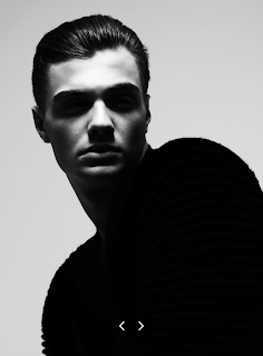
this next image I picked was also taken from Perou, it's a simple portrait but it uses lighting really nicely. His shirt is extremely dark as are his eyes and his nostrils but his forehead and cheeks are quite light, the models hair also has a bit of shine too it from the lighting. In this photo butterfly lighting is used, because of the shadow underneath his facial features including his nose and eyes etc.


Note: I print screened these photos from Perou's website to I apologise for the arrows at the bottom of the photos. All of Perou's photos are copyright so I wasn't able to save them.

Thursday, 19 September 2013

Learning how to research effectively
2. Focal Point
Definition;  Focal Point is the point in which the light entering the lens converges on a single point to generate the image. Focal point is important, depends on what you photographing. Street photography, for example, less relies on focal point.
Tips / How to:

  • Position – Place it in a prominent position
  • Focus – Learn to use Depth of Field to blur out other aspects in front or behind your focal point.
  • Blur – If you really want to get tricky you might want to play with slower shutter speeds if your main subject is still and things around it are moving.
  • Size – making your focal point large is not the only way to make it prominent – but it definitely can help.
  • Color – using contrasting colors can also be a way of setting your point of interest apart from it’s surroundings.
  • Shape – similarly contrasting shapes and textures can make a subject stand out – especially patterns that are repeated around a subject.

Comments:

All of Perou's work is copyrighted so i had to print screen this then upload it to Photoshop  then save it as a JPEG file and upload to my blog.
This photo really caught my eye when i went onto his site (http://www.perou.co.uk/) because it's a sort of rough looking guy on the roof of a building and hes sat on a rocking horse. This could mean many things to different people, it depends what perspective you have on it. He could be trying to escape from his life at home or anywhere else, so he's gone to a quiet place to let loose a little. He could be desperate for his childhood back and he wants to try again or it could mean nothing, just a man on a rocking horse. That's what i find interesting about Perou's work, it could mean anything or nothing, is just the way your eyes see it.

Tuesday, 17 September 2013

LEARNING HOW TO RESEARCH EFFECTIVELY

1. Composition


Definition: Composition is the placement or arrangement of visual elements or ingredients in a work of art, as distinct from the subject of work. It can also be thought of as he organization of the elements of art according to the principles of art.

HOW - TO - STEPS:
1. Learn to think abstract
2. Get your feet moving
3. Use powerful shapes to create bold compositions
4. Create depth in your photos
5. Direct the viewers attention
6. Visual Repetition attracts the eye
7. Use space as a compositional element 
8. Frame your subjects
9. Get the viewers eye moving
10. Provide a logical starting place for the viewers journey

My Comments:

This photo is from Perou's collection 'admit i exist' it's based on homeless people in Liverpool and how they've been living for the past 10 months. The people he's focused on are youths that have been kicked out of their house, or left on their own accord because its been too unbearable to still live there. 16 years old was the youngest person Perou looked at which is really quite moving reading about it.
This photo uses composition very well in my opinion. You catch yourself looking at the photo more than once, the bit that draws you in is the scene, the place itself. Then you see the nearly transparent woman, and you stare at her for a while. After that i noticed that it said 'HOBO' on the bin and the conditions this woman was living in. Step 6,5,9 and 1 have already been used in this photo.

Thursday, 12 September 2013

FIRST ANALYSIS

Vee Speers

FACTUAL
This photo was taken by Vee Speers and it's title is Imortal #3 taken in 2010. In Vee Speer's portfolio he has a range of photos titled 'Immortal' he uses beautiful youths and sets them against backgrounds of post-apocalyptic destruction.  These immortals are real, natural beautiful people, but they seem isolated. This photos price range starts from £5,800-£16,500.

CONTEXT
All the photos in Vee Speers 'Immortal' collection contain pictures of young people, sitting or standing against natural backgrounds. Half naked, although covering their body parts makes the photos really stand out. All the youths seem isolated, exposed and vulnerable, trapped, distant, on guard, defiant and insecure.

TECHNICAL
If you look closely the background looks like it was painted, that is probably because the point of focus is the lady in the front even though the background is also in focus. The first thing I look at when I see the picture is her; mainly because she's bald, naked and looks extremely distant from everything that's happening. The quality of this photo is high standard, you can see the reflection of light in her ear, the tufts of hair on the top of her head, the individual strands of grass etc.

AESTHETIC
I picked this photo out of the 17 in the 'Immortal' section because it stood out to me like none of the others did. The fact she's naked, bald and dark coloured skin makes me think of slavery in the past. Especially as the background is something set on fire and her face looks sad and trapped. When I first looked at this photo I thought that she was running away from a fire or watching one happening, but when I looked at it closer I found something else. To me, it looks like a lady that used to be a slave and she ran away but then her old master found her and abused her, then set her house on fire. I absolutely love this photo, it really speaks to me. 

- madeleine mason
GCSE PHOTOGRAPHY 2013
#1 blogpost